Wednesday, December 17, 2008

No More Plastic Water Bottles on Penn State Campus?

I learned about this encouraging news today. I would have joined the protest if I were still in school! -

Members of the newly formed Penn State Environment, Ecology and Education in the College of Education (3E-COE) group and other environmental activists gathered to protest the sale and use of plastic water bottles at Penn State. The activists also delivered a letter to Penn State President Graham Spanier's office asking him to ban the sale of disposable water bottles on campus.

"Eliminating water bottles on campus isn't without precedent," said Alexandra D'Urso, co-founding member of 3E-COE, citing Washington University in St. Louis as a university that prohibits the sale of plastic water bottles on campus. "We're not asking people to make huge cultural changes."

The letter to Spanier spelled out the environmental and health concerns 3E-COE says are associated with the use of plastic water bottles and gave examples of their negative effects, particularly the amount of discarded plastic polluting the oceans.
(full report)

Instead of creating mountains of landfill out of plastic bottles, why can't we carry water in an eco-friendly and artful bottle such as SIGG's product? A simple change in our daily habits can make a huge difference on our planet!

Saturday, December 6, 2008

Fish in Forest


Is it a dream that fish can swim in the forest? No, it does exist in reality! During the rainy season in the Amazon, the water level of the rivers can rise 10m or more. Thus the rainforest is transformed into part of the river where fish and dolphins swim through the tree trunks. The flooded forest becomes fish's paradise, for they have more places to hide from predators. The trees can also stand in the water for 6 months or more. I learned all this from BBC's Wild South America, another amazing natural world series.

I'm so fascinated with this magic transformation of space in nature. I can't help thinking that even the natural world possesses such flexibility and possibility, what about architecture? Shouldn't there be more wonders to be created?

Thursday, December 4, 2008

Greener Xmas Tree


What a great idea to make a Xmas tree out of recycled cardboards! The tree was designed and developed by Cloud Gate Design LLC, a Chicago based design house. Cloud Gate Design was founded in 2006 by two designer friends, Nick Ng and Dan Greene, as a way to bring environmentally conscious alternatives to market.

In addition to taking the pressure off existing tree farms, a portion of the profits from the Cardboard Christmas Tree sales are donated to the Arbor Day Foundation’s Trees for America Program. For every one dollar donated to the program, one tree will be planted in a damaged forest.

source: Inhabitat

Sunday, November 30, 2008

Wegman Dogs


Dogs 101, a fun series on dog breeds, is airing on Animal Planet. When introduing Weimaraner, it features William Wegman, the artist whose favorite subjects are Weimaraners. I remember seeing the famous Wegman dog on the introduction of an Art: 21 episode.

These Weimaraners (especially the one named Man Ray) almost became icons in contemporary photography. They are supermodels who pose well in front of the camera. Their noble and mysterious appearances have made them particularly charming.

With the current economic crisis, more and more dogs and cats have been abandoned by owners after foreclosure. Animal shelters like Humane Society are desperate for help. Usually it is the best season for adoption, but this winter feels extraordinarily cold and sad. God bless...

Wednesday, November 26, 2008

Holiday Taste - Italian Soda!


Almost everytime I go to Whole Foods, I pick up something new, something irresistable. Last weekend was the Pomegranate Italian Soda. The taste is far from American soda, but rather like a mix of champagne and juice, just so wonderful! It's all natural as well :)

I've already become addicted, and found that Trader Joe's and World Market also carry the product. Ian just bought me new flavors to try: Blood Orange and Orange Passion Mango. Hmmm, it's gonna be a delicious Thanksgiving!

Tuesday, November 18, 2008

Casapueblo


Today on Travel Channel Samantha Brown: Passport to Latin America features Montevideo, Uruguay. My favorite spot there is Casapueblo, a hotel+museum+gallery designed by well-known artist Carlos Paez Vilaró. Sitting on the cliffs, this 13-story building embraces the extraordinary view of the ocean. No straight lines but only organic forms are found throughout the space. He actually built up the walls with his own hands and a simple shovel, just like working on a huge piece of sculpture.

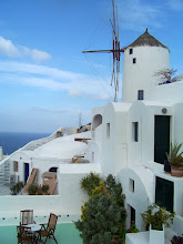
To me, Casapueblo is a combination of the white buildings of Oia Santorini and Gaudi's free forms exemplified in Casa Mila. I'll have to check out all these places in my life!

Friday, November 7, 2008

Wild China


I was totally blown away by BBC’s documentary series Wild China. It’s not only the best documentary in terms of presenting China’s most breathtaking landscapes and wildlife, but also an ecologically conscious journey rethinking the balance between man and nature in the midst of China’s booming economy.

Everyone would be impressed with all the extraordinary views captured by the film crew. They traveled to the most remote yet otherworldly areas to get the first-hand images - wild giant pandas’ copulation was filmed first time ever in history. As a Chinese, I was so touched by all the sacred landscapes and exotic wildlife which are unknown to most of us. At the same time I was deeply concerned about many endangered species out there under human threats. I hope every Chinese can watch this documentary and make efforts to protect the remaining beauty which could be lost forever.

Unique lifestyles of various minorities in China are explored with an emphasis on the use of natural resources. Some Chinese traditions associated with animals and landscapes are also integrated into the depiction of natural environment. The soundtrack is outstanding as well, which results in a perfect fusion between Chinese traditional music and the poetic dimension of the landscapes. Obviously a good amount of research on Chinese culture was accomplished when making the series. I wonder why we Chinese can’t make such high-quality and meaningful shows about our own natural heritages.

Sunday, October 26, 2008

No-Name Jersey vs Helmet Stickers


Last night’s PSU vs OSU was a close game between two football teams with strong traditions. As a Penn Stater living in the Buckeye nation, I found the following fact even more interesting: PSU’s quarterback is from Ohio; OSU’s quarterback is from Pennsylvania. I’m not gonna comment on the game here, just want to point out the big contrast in their jersey styles which reflects the fundamental differences in their football cultures.

The blue-and-white Penn State jersey is probably the plainest among all college teams. More distinctive is the "no-name" feature: only the player’s number is shown on the jersey. This classic and modest look is well in tune with Joe Pa’s coaching style: teamwork rather than individualism is more heavily emphasized. Ohio State jersey, on the opposite, is much fancier especially with the eye-catching buckeye-leaf stickers on each player’s helmet. The stickers have been a long time tradition at OSU to reward superior performance. They serve as a key incentive among football players. It reminds me of the “red flower system” I experienced in my grade school in China, which was manifested in the film Little Red Flowers. Today many colleges are the adopters of helmet sticker system, but it’s certainly not for Joe Pa - "I've never been for that stuff, that's why we've never had names on uniforms because nobody achieves anything without the others.”

It’s hard to say which approach works better, since both PSU and OSU have had excellent performance over the years, and different approach makes each team a unique one. Maybe they should learn more from each other to balance teamwork with individualism.

Monday, October 20, 2008

Gaudi's Architecture in Films

The Passenger is another fascinating film about alienation from Antonioni. The stunning cinematography presents quite a journey from North Africa to London and finally to Barcelona. The female protagonist is an architecture student who accidentally meets the male protagonist (Jack Nickolson) in Barcelona. My favorite scene depicts Gaudi’s Casa Mila where the two meet each other on the rooftop. The following is a Youtube clip in which the original soundtrack was replaced -


Gaudi’s fantastic Sagrada Familia is featured in the film L’auberge Espagnole. The camera reveals the tour of climbing up this exotic church and getting a panoramic view of the city.

For a panoramic view of Gaudi’s works, you can't miss Antonio Gaudi, a documentary by Japanese director Hiroshi Teshigahara. Without voice-overs or commentaries, this unique documentary offers a pure visual presentation of Gaudi's expressive architecture, as if the spaces speak for themselves. The crafted soundtrack adds another layer to the haunting beauty of architecture.

Monday, October 13, 2008

The Wrong House: The Architecture of Alfred Hitchcock


I just finished reading this fascinating book about the architecture in Hitchcock's films. The book gives in-depth discussions on Hitchcock’s unique way of set design and filming techniques based on his profound understanding of space and visual way of thinking. The first two parts of the book focus on an overall account of Hitchcock’s set design, conspicuous architectural motifs, his interests in tourism and so forth. The third part provides detailed analysis of 26 houses from 22 Hitchcock films. Drawings including floor plans, sections and site plans were presented to facilitate the understanding of architectural space.

In order to gain full control of a scene, Hitchcock preferred set shooting over location shooting all his life. From the book, I discovered that some of the most memorable shots were actually made from matte paintings or miniature models. For instance, in Rebecca all the exterior shots of the mansion Manderley were made from different-sized miniatures combined with studio effects, while all the rooms were studio sets. In Vertigo, the tower where the two deaths happen was set up solely for the film. The bird’s-eye view of the tower was just a matte painting. I was amazed at how well those special effects fooled the eyes of contemporary viewers considering some were made 70 years ago.

The chapter on Hitchcock’s preference in domestic setting is also intriguing. The typical Hitchcockian horror exists in a hidden dimension, a horrific dimension underlying our most familiar environments, especially houses. Many of the most terrifying scenes happen in either a house or a motel room, which is best exemplified in Psycho and The Birds. However, Hitchcock did sometimes take strong interests in the tourist gaze. Quite a few dramatic scenes were shot at national monuments such as Mt. Rushmore in North by Northwest and Statue of Liberty in Saboteur. The landmarks shown in Vertigo also make San Francisco even more irresistible to fans like me - I visited most filmming locations of Vertigo the first time I was in San Francisco.

As discussed in the book, the objects in Hitchcock’s films are “never mere props”, but “the very substance of his cinema”. The objects often associate with symbolic meanings, link with tensions and terrors, or even seem alive. Many of these objects are architectural elements, such as a door, a window or a staircase, which have formed some famous Hitchcockian motifs. After reading the insightful analysis on many key objects, I came to realize how many visual details I’ve overlooked during previous viewings. I will go back to those films again for new discoveries.

In short, this book offers a comprehensive examination on architecture’s role in Hitchcock’s films. Despite its theoretical quality, the book is graphically alluring by blending original frames, behind-the-scene photos and architectural drawings. The author also wittily rephrased some Hitchcock’s film names into his key titles, from the book title to some of the chapter names. If you are a Hitchcock fan, you are gonna love this book!

Wednesday, October 1, 2008

Saving Galápagos


Last week I watched a PBS show on Galápagos Islands, which reveals how the booming tourism is threatening the endemic species. Tonight ABC News took a similar look at the issue -

Today, the Galapagos face a different kind of threat: tourism. While the Galapagos hosted 10,000 visitors 30 years ago, last year there were 161,000 visitors. They brought in approximately $350 million, a vast sum for this struggling country.

To support tourism, the local population has grown from a modest 5,000 to 30,000.

Unbeknownst to many tourists, the island does not have a sewage system. Sewage is left to seep into the ground and the sea. With the spike in tourism, the Galapagos' pristine landscape is in danger of being transformed.

These facts are really frightening. If tourism and development continue to grow, this "living laboratory of evolution" would eventually be destroyed. My Ecuadorian friend Cristina, a scientist, has been to the islands twice. She told me how amazing the wildlifes were, but at the same time lamented on the negative impacts of tourism. I definitely want to go there to see the species, but I can't accept the fact that my presence will do any harm to the islands.

Fortunately, Ecuador has started exploring clean energy to deal with the air pollution. For instance, wind turbines were installed earlier this year. The government proposed to declare the islands fossil fuel free by 2015. They also made regulations to limit the number of tourists. Hopefully this exotic place on earth will return to a more peaceful time.

Monday, September 22, 2008

Mexico Trip - Palenque


All of four Maya ruins we visited are impressive. The huge pyramids make Teotihuacán the most spectacular; the small-scale ruins against the turquoise Caribbean sea make Tulum the most charming; the various architectural styles make Chichen Itza the most architecturally striking. But my #1 favorite is Palenque, a Maya city built between the 7th C and 10th C located in the state of Chiapas. Palenque gained its name from the village Santo Domingo de Palenque 9km away, since its original name was lost in time. Palenque seems more breathtaking due to its dramatic geographic setting. The morning mists in the mountains add an otherworldly atmosphere to the ruins.

First discovered in 1773, Palenque has been photographed and documented a few times by European expeditions. The first professional excavation took place 1949-1952 led by
Mexican archaeologists. The excavation still continues today, and archaeologists estimate that only 5% of the whole city has been uncovered so far! Since Palenque was deeply buried in the jungles for centuries, the process of revealing it was exactly the opposite of creating a new park: instead of building everything out of nothing, Palenque was unveiled by removing everything around it, a method of subtraction rather than addition.

Of all the visible structures in Palenque, the palace is the most fascinating to me. The whole palace is a maze: as you walk, you pass through different corridors, courtyards and rooms, while the tall tower always forms a visual center and implies the directions. Beautiful carvings are found on huge stone slabs in some courtyards. The palace is at once architecturally sophisticated and spatially interesting.


East of Palenque in Guatemala stands the larger Maya ruin Tikal. Hopefully I can get there someday!

Saturday, September 20, 2008

Cool Interiors from Paul van Dyk's MV

I watched Paul van Dyk's DVD Global, a MV collection filmed in several cities around the world. I was fascinated with the cool interiors shown in this MV Tell Me Why, hoping to find more info on the design.

Thursday, September 18, 2008

Sarah Palin's glasses

Sarah Palin is starting a new eyewear trend these days. Her rimless glasses with titanium frames were designed by Japanese designer Kazuo Kawasaki. I do love the design and hope to get a pair if I could afford the price of $375.

Kawasaki was shocked by this soaring demand for his design under Palin's influence. But he asked American voters to pay attention to her positions on the issues, and not vote on image or his glasses. I hope for the same!

Tuesday, September 16, 2008

Mexico City - José Vasconcelos Library


Before my trip, I saw the above interior photos of José Vasconcelos Library, a huge and modern library in Mexico City. But when I really got there, I was disappointed to find it has been closed for a while. The newly updated wiki page gives the following account -

The Library had to be closed down in March 2007 because of defects of construction. The Superior Auditor of the Federation detected 36 irregularities in its construction and issued 13 motions of responsibility for public servants of the federal government. Among the irregularities found was the misplacement of marble blocks at a cost of 15 million pesos (roughly 1.4 million dollars).

What a shame such a good design didn't get built well and so much money was wasted! I happened to find someone's blog with many pics of this library when it was still in use -

Saturday, September 13, 2008

Mexico City - Luis Barragán


Luis Barragán is the most important figure in Mexican modern architecture. Visiting his house and studio naturally became a priority for our 2-day in Mexico City. Trained as an engineer, he practiced as a designer in not only architecture, but also furniture and gardens.

The solid surface at the entrance separates the house completely from the street. The interior presents a totally different world filled with light and colors. The main space is double-height, and divided by low walls. The huge window opening to the garden blurs the boundary between inside and outside. The nicely designed garden forms a mini jungle in the courtyard.

Barragán widely traveled in his earlier life, so a good collection of books and crafts from various nations are found throughout his house. Inspired by Le Corbusier and Mies, Barragán's design shows a pefect fusion between European modernism and indigenous cultures of Mexico.


Light and shadow was a major interest in his design, for instance, the play with light and shadow by adjustable shutters, the use of windows and skylights to embrace views and natural light. The subtle use of light and shadow simply adds a phenomenal quality to his minimalist style, which also had a strong influence on Tadao Ando.

The house is an introvert space speaking of its own language inside the
bustling city, a space of poetry written in light, texture and color. Unfortunately, we didn't have time for Francisco Gilardi House and Tlalpan Chapel, two of his excellent works in Mexico City.
(Note: Photos are only allowed at the roof terrace, so I had to use internet pics for other areas)

Wednesday, September 10, 2008

Mexico City - Blue House


My travel motivation often comes from film. I had been dreaming about Mexico City since I watched the film Frida (2002). The images in the film are just unforgettable: the vibrant colors of Mexican architecture, the spectacular pyramids of Teotihuacan, and of course the imaginative paintings by Frida...I became more eager to see Mexico after seeing Sergei Eisenstein's fabulous documentary Que Viva Mexico! (1932) in which he captured the Mexican charm at its purest.

The 'blue house' where Frida grew up has become today's Frida Kahlo Museum. It's located in Coyoacán, a cultural neighborhood in the south of the city. Eisenstein was actually a friend of Frida and her husband Rivera, and visited them in this house before.

Before stepping into the exhibition rooms, I was already overwhelmed by the beauty of the courtyard: the bright blue stucco walls against textured grey stones, surrounded by evergreen tropical plants and primitive sculptures. A video of Frida dressed in traditional costume dancing around the courtyard was being played at one corner. The more I walked around, the more alive Frida appeared to be.

The interior houses her paintings, artifacts, photos and letters. The large and bright studio on the second floor offers perfect views into the courtyard. The dried oil colors were still lying on the table...

Wherever you go, the space is full of art, life, beauty and modesty. It was the first time I was so moved by vernacular architecture instead of a starchitect's works.

Tuesday, September 9, 2008

Paths in Mexico


Our past Mexico trip was unbelievable - We took seven flights and over 20-hr bus rides to get to nine places during the eleven days. Above is a map showing our itinerary inside Mexico (blue line for flight, red line for bus tour; click on the image for a better view).

The places we visited have different characters: from the global city Mexico City to traditional towns like Merida, from beautiful carribean beaches to lush tropical rainforests, and three major maya ruins with different charm...We had to skip places like Puebla and Oaxaca due to time constraint.

Mexicans are very friendly and happy people. Wherever we went, there were locals offering us help even though they don't speak a word of English. I really fell in love with Mexico and hope to return someday.

Monday, August 25, 2008

Salar de Uyuni

When planning my upcoming Mexico trip, I happened to see these amazing pics of Salar de Uyuni, the world's largest salt flat in southwest Bolivia.


The salt mounds reminds me of Andy Goldsworthy's "ice cone". When covered with shallow water, Salar de Uyuni becomes extremely reflective. The human figure in the middle recalls the atmosphere in Antony Gormley's work Another Place (1997).

Bolivia is already on my travel wish list!

Sunday, August 10, 2008

Coca-Cola "Bird's Nest" Commercial

This is the CUTEST Olympic-themed commercial I've seen recently. Can't help watching it over and over again :)

Thursday, August 7, 2008

China Doll Club Beijing


It's the final countdown for the Beijing Olympic Games. I happened to see these eye-catching images at Coolhunter: a cool night club named China Doll in Beijing, owned by Chinese-american actress Ai Wan and designed by her studio E.P.I.C. Design. The interior is so sexy, mysterious and futuristic. Will check it out next time I go back!

Tuesday, August 5, 2008

Radiohead LED Stage Lighting


Last night's Radiohead concert was truly amazing! After so many years, they still remain the most innovative British rock band. The performance was certainly fantastic, but something else got me even more excited: the cutting-edge LED stage lighting!! Radiohead is the first band ever to tour with only LED lighting. By hanging strips of lights over the stage, seemingly infinite patterns and colors were produced which were constantly transforming like auroras.

How great such an influential band is going GREEN. The dazzling visual effects of their show prove that LED is really the future!

Here are some videos showing the lighting -


Tuesday, July 22, 2008

Mowercycle!


I was chatting with a friend about redesigning everyday objects a moment ago, and then I saw this mowercycle photo at Inhabitat. What a bright idea to transform the tedious yardwork into personal workout! Needless to say, you can stay away from the air pollution produced by gas-powered lawn mowers. I hope such mowercycles can be manufactured.

Friday, July 11, 2008

Shopping Cart Chair

When I looked at the shopping carts at a supermarket last night, I suddenly noticed the proportion of the shopping cart resembles that of a chair. Why not design a shopping cart chair or convert a shopping cart into a chair? Would that be fun?

Later I did an internet search and found someone already had this idea. The following are ANNIE shopping cart chairs by UK designer Max McMurdo. He turned old unwanted shopping carts into beautiful and functional chairs. I wonder if they offer the option with wheels, 'cause some people may want an exhilarating ride:)

Wednesday, July 9, 2008

Eames Stamps!


My husband bought me the last 2 sheets of the newly released Eames Stamps from a downtown post office. These stamps are gorgeous!! If you wanna collect them, hurry up 'cause only some post offices carry them.

Tuesday, July 8, 2008

Toronto Arch Tour

As a water-front metropolis, Toronto is not as appealing as New York, Chicago or Seattle. My initial purpose of the trip was to see several new buildings in town and to visit the spectacular Niagrara Falls the 4th time.

Our first stop was the Royal Ontario Museum by Libeskind. I was so eager to see a Libeskind’s building, but felt a bit disappointed when I got there. Maybe I’m no longer strongly attracted by striking forms. The play of form here didn’t invent a new model for exhibition or offer the visitors a new way to experience a museum, almost the same feeling I had when visiting Akron Art Museum by Coop Himmelblau. To me, the only interesting space is the Stair of Wonders which combines the sculptural form with fascinating object display at each level. However, I still want to visit Berlin Jewish Museum since the spatial sequence generates deeper meaning.

Gehry’s new addition to the Art Gallery of Ontario is under construction right now. Unlike his signature sculptural exterior, this building has a simple linear transparent skin while the crazy forms are kept inside.

Ontario College of Art & Design by Will Alsop is such a playful and structurally challenging building. I really hoped to get to the top, unfortunately it closed during the weekend.

Later we walked by the Graduate House by Morphosis and Leslie L. Dan Pharmacy Building by Norman Foster on Univeristy of Toronto campus, the last two stops of my architectural tour.

From the Ground Up


The latest Architectural Record is titled Beijing Transformed which focuses on the Olympic projects and reflections on the speedy changes. They even included an interior shot of BNCC which we worked on, but didn’t mention NBBJ’s name.

After seeing the pictures of all the famous buildings again and again, what caught my eyes are the ‘behind the scenes’ photographs: those captured the construction workers taken by photographer Iwan Baan. These migrant workers should not be forgotten, for they are the people who are building the new Beijing under heavy workload and low wages.

Wednesday, July 2, 2008

Jail Hotel VS Restroom Castle


Michael Moore’s documentaries always reveal some shocking facts, such as the “prison hotel” in Roger & Me (1989). As a response to the increasing criminal rate in the abandoned automobile city Flint, a large brand-new jail was built. On the night before it opened, a big party was held there and a couple could pay $100 to stay overnight. Many people paid to stay because they wanted to have the experience of living in jail. Ironically, the most luxury hotel Hyatt went bankrupt due to lack of visitors.


This phenomenon reminds me of the world’s largest restroom, as one of the main structures of a theme park in Chongqing. The building looks like a cheap amusement park castle with 1000 toilets inside. Some of the urinals have fancy shapes such as a crocodile mouth and Virgin Mary. It was the mayor’s decision to make a new attraction or a “culture” out of the toilet. To their satisfaction, the huge restroom entered the Guinness World Record. But I doubt what kind of attraction or culture it will bring to people simply considering the smell of that place.

In the realm of profit-driven capitalism, either the form or function of a familiar space can be replaced. In this case, prison and restroom are transformed into festal space. The degree of being public or private in such space also gets shifted: the jail hotel becomes
publicly private; the restroom castle becomes privately public. Is it a new type of heterotopia?

More satirically, the restroom is made of all recycled materials. Perhaps it’ll get LEED certified? Remember the 60-story single-family home being built for the Indian rich is also a green building? Does the idea of sustainability not offer a convenient excuse to build socially controversial buildings today?

Monday, June 30, 2008

Stunning Opening Credits

The Kite Runner (2007) is one of the great movies I watched recently. Like Persepolis (2007), it is also based on a bestselling book. Both films recall childhood memories and reveal the political horrors. From a design perspective, what impressed me most about The Kite Runner are the opening credits: a beautiful and dynamic fusion of the Arabic and English characters.

It reminds me of another wonderful film, The Namesake (2006), whose opening credits is similarly stunning. The letters transform from Bengali into English with abstract paintings in the background. The blending of the two languages reflects the notion of cutural transition in the movie.

Sunday, June 15, 2008

Chasing through a Favela


The Incredible Hulk is just another blockbuster movie. One thing that caught my attention is the mountain favela of Rio de Janiero in the opening sequence. The apartments are so densely packed together like piles and piles of containers. The place just looks UNREAL! I can’t imagine how people could live in such density with minimum room for trees and natural light. Apparently such a site is exotic enough for a Hollywood chase scene: the connected up-and-down rooftops, the dark and narrow alleys….

It’s not surprising that Hollywood action movies are exploring some of the poorest areas in Africa, Asia and South Africa, just to offer the viewers a fresh and different look. It instantly raises the controversial question between tourism and poorism. As a matter of fact, the favela shown in Hulk has been a tourist spot for 16 years. Is it really exciting to watch a chase in a favela like this? Will the movie bring more tourists to the slums? Or will it bring some positive attention or changes to the living environment of the residents?

Here's a related article Slum visits: Tourism or voyeurism?

Home Cherry-picking

It's the cherry harvesting time in my backyard. We got more cherries this year and they are sweet!

Wednesday, June 11, 2008

GTF on Show


I learned about GTF (Graphic Thought Facility) from Metropolis magazine earlier this year and fell in love with their innovative and playful design. I just found out their works are on show at the Art Institute of Chicago until Aug 17!

Graphic Thought Facility: Resourceful Design
March 27–August 17, 2008Gallery 24

Overview: Graphic Thought Facility (GTF) is the first exhibition at the Art Institute devoted solely to graphic design. Established in 1990, the studio led by Huw Morgan, Paul Neale, and Andy Stevens has emerged as one of the most progressive and creative design firms working in both two and three dimensions. The firm is well known in Britain for creating the brand identities of some of the bastions of British design, including Habitat, a furnishings and interior design retailer launched in 1964 by Terence Conran; the Design Museum in London; and Frieze, London’s major annual contemporary art fair. Also active in book design, GTF designed monographs on the work of Ron Arad and Tord Boonjte as well as the exhibition catalogue for the 54th Carnegie International in 2003, all of which are presented in the exhibition.

Friday, June 6, 2008

2 Great Art TV Series


I recently watched Simon Schama’s The Power of Art. It’s an excellent TV series on 8 genius artists in history, written and presented by Prof. Schama. I have to admit that BBC makes the most refined educational documentaries, since the quality of storytelling, photography, music and visual effects are almost perfect. The story of each painter is told in an adequately visual way: the important events and characters are acted out, others are illustrated with metaphorical images. The part of storytelling, painting presentation and Schama’s insightful comments are well integrated.


At a few times, a painting made me cry. I would not have been so touched without the profound background and analysis given by Schama. I gained a much more comprehensive knowledge about those artists. For instance, I knew Turner as merely a romantic landscape painter before. After watching the show, I realized I overlooked the most powerful aspect of his works - those depict the devastating disasters in human history, esp. Slave Ship as an emotional representation of the shockingly inhumane event happened in 1781.


Compared to the high-cost BBC series, PBS makes intriguing and informative documentaries at low budgets. A good TV series I watched recently is Art:21 which offers a great introduction into contemporary visual art. The show covers 72 influential artists living is US, including my familiar ones like James Turrell, Richard Sara, Cai Guoqiang, Maya Lin and Krzysztof Wodiczko, as well as many others I didn’t know of. The best part is seeing the work process of each artist, accompanied with the artist’s own interpretation. Each episode presents a theme by introducing 4 related artists. I can understand the advantages of doing that. But often times I found the artists’ works don’t fit into just one category. By sorting them out, it simplifies the broadness and complexity of the artist’s approach. That’s my only criticism of the show.

Thursday, May 29, 2008

Ensemble Film

Most films have a single storyline focused on one or two leading characters. Ensemble film, however, provides us a broader spectacle by presenting multiple storylines with a group of equally important characters. These characters are interconnected directly or indirectly. Time becomes parallel, and our vision becomes panoramic as we move from one event/group to another.


The earliest ensemble film I’ve seen is Spike Lee’s Do the Right Thing (1989). It pictures the daily life and racial conflicts within a black neighborhood in Brooklyn on a sizzling summer day. The switch between different characters feels so natural, as if we are walking down the street encountering the real life of the neighborhood. It’s very funny, satirical, at the same time realistic. The famous “fuck all” rant in his later film 25th Hour is actually a condensed version of the themes in Do the Right Thing.


Two years later, Richard Linklater made Slacker. I don’t much he was influenced by Lee, but Slacker appears to be an extreme case of ensemble film: we follow one group of people down the street, then another group pass by and we start following them instead. Thus the whole film flows between all the different characters who don’t know each other but only pass by each other by pure chance. The common thing among these people is that they are all slackers on the street.


Robert Altman’s The Player came out one year after. The opening sequence uses the same continuous flow as seen in Slacker. Then Altman made his exemplar ensemble film Short Cuts which palpably presents the everyday lives of typical families in LA. This film probably influenced many famous ensemble films later, such as Magnolia (1999), Crash (2004) and Babel (2006).

Thursday, May 22, 2008

Nature & Design - Jellyfish


Nature has always been a powerful source for design inspiration. Jellyfish is one miraculous design by mother nature: it is attractive for its exotic beauty, at the same time it's repulsive due to its poison. My favorite jellyfish images come from BBC's classic Blue Planet (above).

The unique form, color and texture of jellyfish has inspired so many designs, including product, architecture and art.

Jellyfish light fixtures

Jellyfish Sonic water speakers by Kota Nezu

Jellyfish House by IwamotoScott Architecture

Ceramic Jellyfish by artists Alissa Coe and Carly Waito