Thursday, December 31, 2009

To Venice


You are a labyrinth interwoven with water. I don’t even try to find my direction since reading a map is both useless and unnecessary.

I understand the very charm of you is not in those famous landmarks. The best way to appreciate you is by wandering, like in the bookloft.

I can’t explain my fascination with water and anything standing in the water. But I do know why I love the intricate network of narrow alleys - a reminder of the hutongs in Beijing. You happen to obsess me with both. How can I step away from you?

I want to leave my footprints on every street and every bridge of you. Three days seem too short! Wish I can walk in you endlessly, never ever stop. I would lose my way forever, like the protagonists in Last Year at Marienbad

Monday, December 28, 2009

Surprise in Ancona

I didn’t expect much of Ancona before the trip, as Google Image only came up with some unattractive photos. However, when I walked deeper and deeper into the city , I discovered some unpretentious but interesting buildings.


One of the surprises is this contemporary apartment building among the classic blocks. It sits on a slope with its roof sloping in the same direction. The form of the building is not uncommon, a popular method of carving into one big block. A balance between individuality and unity is achieved by providing each unit a good amount of character.


Walking along the stepped street in front of the building was interestingly pleasant, as I observed the changing face of each window and various plants along the street or on the balconies. As I walked up the steps, I saw another building with a similar look further up the slope. But I found this one more appealing because of the terraced garden on the back.


The landscape design is so modest but charming, just like Ancona itself. I especially enjoyed the various paths leading to different levels and directions, and the rich texture of the paving bricks...


Thanks to Google Earth, I not only located the building, but also got to see the overall plan. The aerial photo even reveals some interesting designs on the roof terrace.


Sunday, December 27, 2009

Thursday, December 10, 2009

Old Maps


I love old maps for their richness. They are usually very artistic and narrative instead of being purely technical like most maps today. On our way to the Sistine Chapel inside the Vatican Museum, we passed through the gorgeous Gallery of Maps. Besides the 40 large topographical maps of Italian regions, there are also several graphic maps depicting important cities. I was so excited to find three places I just visited -

The most noticeable one is the map of Venice at the end of the gallery. If you look closely, you will find captivating details of the Piazza San Marco.


The most noticeable one is a map of Ancona. I find it much less successful since the sail boats are too dominant whereas the city itself is hard to read.


The following one doesn’t show the name. My best guess is Lucca, judging primarily from the shape of the city wall. But I'm not sure about the pentagon at the bottom left corner.


I later found out that the maps in the gallery were commissioned in the late 1500s by Pope Gregory XIII. It took friar and geographer Ignazio Danti three years to paint. Although made 500 years ago with ancient instruments such as the Astrolabe, the maps are said to be amazingly accurate. I found an article discussing the accuracy of Danti's maps, very interesting:

http://goeurope.about.com/od/travelphotography/ig/Travel-Pictures/Vatican-map-Garfagnana.htm

Sunday, December 6, 2009

Footprints in Eastern Mediterranean


My first trip to Europe was almost perfect
10 nights on land, 7 nights at sea
Each place has its own charm -

Rome is POWER
Vatican is DIVINITY
Florence is ART
Venice is ROMANCE
Siena is EXQUISITE
Lucca is WARMTH
Pisa is FAME
Ancona is UNPRETENTIOUSNESS
Athens is ELEGANCE
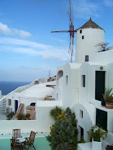
Santorini is SCULPTURE
Mykonos is FESTIVENESS
Corfu is PICTURESQUENESS
Dubrovnik is PERFECTION

I left my heart in Venice, Santorini and Dubrovnik. Will blog them in detail when I have time!

Saturday, October 24, 2009

Fellini's Rome

Being an enthusiastic film location hunter, I was inquiring the possibility of a movie tour of Fellini’s Rome. After reading a little bit the book The sites of Rome: time, space, memory, I found out that his Rome was mainly constructed in studio 5 at Cinecittà, including even landmarks such as St. Peter's dome and the Colosseum. I wasn't aware that he preferred set shooting so much, quite the opposite of Antonioni's situationist style. Even though I'm still gonna see the famous Trevi Fountain in his La Dolce Vita.


As discussed by Elena Theodorakopoulos, Fellini's films may be said to visualize Freud's much-quoted idea that:
Rome is not a human habitation, but a psychical entity with a similarly long and copious past - an entity, that is to say, in which nothing that has once come into existence will have passed away and all the earlier phases of development continue to exist alongside the latest one.

In Fellini's own words: Tramping around from ruin to ruin doesn’t mean anything to me. My Rome is from the movies of my childhood.

If Fellini's Rome is a cinematic spectacle inspred by his collective childhood memory, then Tarkovsky's Italy is a mirror which reflects his deep Russian nostalgia. My favorite scenes in Nostalgia were filmed at Bagno Vignoni, a small village famous for its thermal baths. It's about an hour's bus drive from Siena. But I probably won't have time for it as I have only one day in Siena. Anyway I'll see Michelangelo's Piazza del Campidoglio, another distinct filming location of Nostalgia.

Thursday, October 22, 2009

Tetsuya Ishida

Several douban friends recommended Tetsuya Ishida's paintings. I thus came to know this talented Japanese painter who died in 2005 at the age of 31 (probably a suicide). His surreal self portraits remind me so much of Frida Kahlo. His own body is frequently presented as part of a machine or a built object, tragically trapped in the suffocating urban surroundings. Through his desperate gazes, we sense his deep loss of freedom, identity, emotion, nature, childhood joys...


View his complete works at: http://www.tetsuyaishida.jp/

Monday, October 19, 2009

Foliage Weekend

Living in Pennsylvania for six years made me a fall-foliage addict. Although Ohio lacks the hilly topography which creates dramatic views, I still found favorite foliage places such as Hocking Hills and Highbanks soon after the move. This year we have to skip the long ride to Hocking Hill and took Chloe to the three beautiful metro parks: Highbanks, Prairie Oaks and Battelle Darby Creek.

Yestersday was actually our first time going to both Prairie Oaks and Battelle Darby Creek and we were really impressed. Prairie Oaks has three adjacent lakes with Big Darby creek running in between. We walked on a beautiful trail with a lake on one side and the creek on the other. Since most trails are pet friendly, we saw many happily walking dogs. Next time we'll bring Rexie for sure despite his car sickness!

Prairie Oaks

Driving south about 15 minutes, we arrived at Battelle Darby Creek. The two parks are linked by the same creek: Big Darby. We found a gorgeous view overlooking the creek as well as more colorful foliages in the woods here which recalls Highbanks.

Battelle Darby Creek


What we explored in either park is only a small portion of the entire land - more to discover in the future!

Thursday, October 15, 2009

The Book Loft

Reading my friend's negative comments on the Book Loft made me want to write something about this unique bookstore. To me, the Book Loft is more than just a bookstore. It stands as a living example of dynamics in architectural space. Firstly, it blurs the boundary between public and private space and reverses the normal condition: a public bookstore in the setting of a private house. Isn’t the reversal of dining room and bathroom in Buñuel's The Phantom of Liberty an extreme case on this subject?!


One of the bookstore’s charms lies in its linear courtyard as the main entry. This serenely beautiful courtyard immediately turns the street scale into a personal scale, brings one’s mind into a peaceful retreat. Further down the path, the display windows on your right side create another type of storefront which is immersed in the domestic atmosphere rather than a commercial street feeling. Bathed in the warm yellow light at night, one can easily have the sense of going home on a cold winter night.

The linear courtyard reminds me of a charming little community garden I once visited in Philly. It is a water garden on the side of an old building, about the same size and shape as the one at the Book Loft. A ‘beer barrel’ at the corner collects stormwater from the neighboring roof which is reused for irrigating the garden. Three correlative murals depicting water cycles were done by the kids in the community.


Secondly, the Book Loft stands as a proof that getting lost is not necessarily a negative quality of architecture. This old Victorian house is a labyrinth that consists of 32 rooms of books, endless passageways, and staircases leading into new dimensions. However, this place is meant for wondering, exploring and getting lost only if you enjoy such a slow-paced and adventurous shopping experience. Associated with the quest for knowledge, isn’t the labyrinth a perfect metaphor for a bookstore? I still get lost after being there quite a few times, and each time I discover some new territories in both the architectural space and book collection. It is a similar experience every time I revisit a favorite film, picking up some unnoticed details.


Unlike box-shaped chain bookstores where one is always under surveillance, this maze-like space offers a perfect hiding place among the book jungles, which is rarely found in contemporary architecture. The Book Loft is probably a place Mr. Hulot would love! Anyone who is familiar with Tati’s Playtime knows that a large minimal glass cube is no more directional than the Book Loft, needless to say the lack of spatial interest or human attachment people can get out of.

I agree with my friend that their book selection needs to be improved. It would be great to include rare books and used books. Amazon is definitely the best place if you only care about selection and price. Nevertheless I still find Book Loft a hidden gem in this suburban city especially considering the fun experience it provides. Looking forward to my next half-day retreat, Hmmm…

Sunday, October 4, 2009

Gallery Hop on Moon Festival

It was such a coincidence that the monthly Cbus event and the Chinese festival fell on the same day yesterday. We took Chloe to the hop for her first art experience. Carrying a 4-month old, I had no time to ponder upon any artwork this time. I still found the walk very enjoyable when browsing the funky galleries and stores, seeing so many people on the street, feeling the vitality of urban life. The Gallery Hop is one of the few occasions I can truly experience the urban flavor in town. I always find Cbus quite suburban, even the downtown area, compared to most other cities. I think it is all because of the homogeneous density.

Later we had yummy sushi at Kooma. A DJ showed up during our dining, bringing vibrant beats into the atmosphere. Chloe fell asleep amidst the seductive food smell and the exhilarating music!

Our last stop was the Book Loft, my No. 1 favorite spot in Cbus. I was immediately attracted by the beautiful side yard under the lights as I’d never been there at night before. I couldn’t help snapping a couple of pictures with my iPhone. I got lost again this time, and how I enjoy getting lost in this book maze! I brought a list of books I found on their website, unfortunately none of them are in store. Too bad I couldn’t spend money:)


The only imperfection was the lack of the moon due to the heavy clouds. I had to picture a bright full moon in my head…

Wednesday, September 30, 2009

Such Great Heights

I had to save this photo when I saw it on NPR this morning. Unbelievable, isn't it?! Found in Prairie Creek Redwoods State Park, this tree is at least 1500 years old and 300-foot high! The climbers' tiny bodies in the photo give you the best sense of scale. National Geographic photographer Michael Nichols spent a year photographing the giant redwoods in California. The process is quite interesting: he devised a way to do redwoods justice. It involved three cameras, a team of scientists, a robotic dolly, a gyroscope, an 83-photo composite and a lot of patience. The largest tree elevation is thus assembled! (see the video on NPR)

Hopefully I can travel to that State Park someday. My fascination with giant old trees originated from the forest scene in Hitchcock's Vertigo. I've traced the footsteps of Madeleine and Scottie through the redwoods at Muir Woods. The cycle of life and death, the cycle of death and rebirth, the poetic melancholy, the enigmatic beauty, will haunt me forever...

Thursday, September 24, 2009

Waiting for the Love Story of Capitalism


I'm thrilled to hear about Michael Moore's new documentary Capitalism: A Love Story on NPR today. Always attracted by Moore's provocative documentaries, I wonder what controversies this one will stir up in American society. From his previous sensitive subjects such as terrorism and health care system, he makes a further step to investigate the much more substantial and fundamental issue: Capitalism itself.

Placing the yellow crime scene tape around Wall Street is so very Michael Moore, reminds me of the mock funeral he staged outside the HMO's headquarters in Sicko. His confrontational style has a powerful comedy and irony effect which is somewhat reminiscent of Chaplin.

Can't wait to watch Capitalism. Oct 2nd - Yes!!

Sunday, September 20, 2009

Jeremy Liebman


I'm intrigued by the fashion photographs from American photographer Jeremy Liebman. He studied both film and liberal arts in college, no wonder his works exhibit a lot of consideration on the relationship between human body, costume pattern and space. Fashion design is best displayed against the minimal composition of the geometries. I find the first image really stunning, and also love the the sutble expression of light and shadows in all these photographs.

view more of his works at http://www.jeremyliebman.com/

Wednesday, September 2, 2009

Funky Dishwashing Gloves


As I need to wash a lot of Chloe's stuff these days, I decided to get a pair of dishwashing gloves to protect my hands. A little bit internet search led me into the world of funky dishwashing gloves. My favorites are the Lushlife sponge gloves (upper image) - so adorable and practical! The Couture series (lower image) are fine too, stylish with a retro and feminine look. Guess I'll get a pair of Lushlife to make everyday washing a fun experience!

Sunday, August 9, 2009

Navel Tomato


It's the harvest time in my organic farm: tomatoes, cucumbers, zucchinis and colored peppers! Today I found this unique tomato and called it 'navel tomato'. Nature is the most fantastic designer and creator with a sense of humor. This tomato just reminds me of the heart-shaped potato in Varda's wonderful documentary The Gleaners and I, the perfect visual metaphor of the film's essence.

Tuesday, May 12, 2009

Buena Vista Social Club


I accidentally picked up the DVD Buena Vista Social Club (1999) in the library the other day and was left in awe after watching it. Buena Vista Social Club was the club in Havana where a group of Cuban musicians gathered to play during the 1940s. American guitarist Ry Cooder learned about those long-forgotten brilliant musicians and brought them together almost half a century after the club was closed. To my surprise, the director was Wim Wenders, who was persuaded by his friend Ry Cooder to make this documentary. The film is a combination of concert footages, interviews with each musician, and the shots of streetscape and daily life in Havana.

Already a big fan of Latin jazz, this documentary opened up a whole new horizon of traditional Cuban music in front of me: I got to know quite a few talented musicians whose names I’d never heard of, and learned about the personal side of my favorite musicians whom I only knew from CDs. While watching them in real life and hearing them telling their personal stories, I couldn’t help falling in love with the Rubén González’s elegance, Compay Segundo’s sense of humor, Ibrahim Ferrer’s sincerity….

One unforgettable scene leads the viewer through the empty interior of an old and beautiful colonial building, and then the camera moves towards Rubén González who is playing the piano and starts circling him slowly. Both the decaying interior and the wrinkled face of González are telling the story of aging, yet the music born out of his fingers remains youthful and passionate.

Despite all the political obstacles between US and Cuba, the musicians finally traveled to New York and performed at Carnegie Hall in 1998. The audience were simply overwhelmed by their passionate music and the musicians were left in tears. It was the final legendary show of Buena Vista Social Club considering some the musicians were in their nineties at the time. Today all the prominent musicians have already passed away, but their music never dies and continues to reach the hearts of people all around the world.

Regarding the filmmaking, I’m a bit disappointed with the way Wim Wenders handles the materials. I find the following two things quite disturbing: one is the excessive appearance of Ry Cooder and his son throughout the film. I understand Ry Cooder is a good friend of Wim and the organizer of the club’s reunion, but it makes no sense to give him more spotlight than any of the musician in the film; the other is the musicians’ reactions on touring New York City. They kept remarking on how beautiful the city is, which sounded so corny and destroyed the dignity of the musicians.

With Obama’s new policy, traveling to Cuba will no longer be a mission impossible for US residents in the near future. I can’t wait for the day to walk down the streets of Havana seeking the traces of Buena Vista Social Club, soaked in the enchanting traditional music. That’s another big motivation for my Spanish learning!

Here's the link for Buena Vista Social Club's Chan Chan (1998). I almost cry everytime I watch it -

Sunday, April 19, 2009

Cat Score


The Sound of Painting is a fascinating and informative book I read recently. It explores the mutual inspiration between early modern art and early modern music by examining numerous artists’ works inspired by music.

In the chapter of Graphic Music, I was intrigued by several pieces of work which innovatively visualized music. The wittiest one is this Cat Symphony by Austrian painter Moritz won Schwind (1804-1871). He dedicated the score to Joseph Joachim (1831-1907), a renowned Hungarian violinist and composer. He described his idea of reforming the linear notation system as ‘this darling attempt to put a more expressive, spiritualized notation system in the place of this outmoded, obsolete, pedantic, and dry-as-dust copycat business.’

Wednesday, April 8, 2009

Tativille, Paris!


Just saw on Criterion's website a large-scale retrospective of Tati's work opening today in Paris! -

Paris is turning into Tativille starting tomorrow, April 8, until August 2, with the Cinémathèque française’s appropriately large-scale retrospective of the famously ambitious French filmmaking legend’s work, “Jacques Tati, deux temps, trois movements.” Curated by Stéphane Goudet and Macha Makeïeff, the exposition is in honor of the director’s 102nd birthday (“just in time for an homage divorced from obligatory celebrations, which he was not keen on,” the curators tease), and will feature not only screenings of Tati’s films (including a new print of M. Hulot’s Holiday) but also exhibitions of props, costumes, screenplays, outtakes, and drawings and paintings by his friend and art director Jacques Lagrange. Add to all that guided walking tours of Tati-related architectural landmarks, screenings of a new six-part documentary on Tati called The 6 Lessons of Professor Goudet, and interviews about Tati with contemporary directors (including Michel Gondry, Wes Anderson, David Lynch, Otar Iosseliani, and Olivier Assayas) on view around the exhibit, and you have one seriously tantalizing Tati traffic jam. (source)


The exposition is held in the Cinema Museum designed by Gehry. I'm so attracted by the miniature model of Villa Arpel from Mon Oncle. I also can't wait to find out how much the real Paris overlaps with Tativille by walking down the streets. Being a super Tati fan, I wanna be there so badly!! Maybe the best I can do now is to revisit his great films.

Thursday, April 2, 2009

In the Eyes of Annie Leibovitz


When talking about Annie Leibovitz, the two images one would associate with are probably: the Rolling Stone cover of John and Yoko lying together, the last photo of John taken a few hours before his was shot, and the controversial Vanity Fair cover of Demi Moore’s nude pregnant body.

After watching a documentary on Annie and reading her book Annie Leibovitz at Work, I got more insights into her life and photography. Besides the famous celebrity photos for the magazines, her works also touch upon broader themes such as social and political events and natural landscapes. In the book she reveals how each well-known photograph was made. She is not only good at staging the characters in a symbolic setting relevant to ones’ artistic identity, but also has a sharp eye in capturing the very charm in one’s natural state.


One appealing photo from the documentary is the surrealistic portrait of Isabella Rossellini and David Lynch, both my favorite characters. The photo stands as a perfect metaphor of the uninterpretable and dreamlike quality of Lynch’s films. Lynch's face is hidden behind the black mask, which seems to imply the fact that he has always resisted interpreting his works.


When browsing the book, I was excited to find a photo of 94-year-old Philip Johnson in his Glass House. Interested in architecture, Annie went to photograph the Glass House one day and Johnson happened to be there. The photo thus came by accident, which captured a meditative quality in the architectural space, surrounding landscape and the person.

Wednesday, March 18, 2009

Sun House in Haiti

I'm working on a rendering for a building in Haiti this week, which makes me wonder about the architecture there. What kind of building should we propose for the people and environment there as Haiti remains the poorest Caribbean country?

I found The Sun House, an earthbag building project at Pwoje Espwa in Southern Haiti. Father Marc Boisvert, the founder and director of Pwoje Espwa (http://www.freethekids.org/), has dedicated his life to serving and helping suffering children. This project not only houses over 700 children, but has an agricultural project, three schools, carpentry and masonry facilities, and an arts and crafts program.


The finished building is quite charming especially after the local artists' decoration. What a perfect fusion of the sustainable building techniques and the unique Haitian art and culture! More process photos can be found here: http://earthbagbuilding.com/projects/haiti.htm


The website EarthBuilding.com offers comprehensive information on earthbag construction, and I learned a lot about the advantages of this building technique. First, earthbag building is very low-cost and easy to build. Second, earthbags function well as either thermal mass or insulation, depending on what the bags are filled with. Third, earthbag structure can be fairly strong if properly constructed. Fourth, earthbag technique works better with non-rectilinear shapes, thus becomes a great tool for creating unique sculptural forms. I'm so tempted to build one myself!


As my Haitian dream continues, I watched Divine Horsemen: The Living Gods of Haiti, an unfinished documentary made by Maya Deren filming the voodoo rituals in Haiti. It's remniscent of Eisenstein's unfinished masterpiece ¡Que viva Mexico! which captures the soul of Mexican culture and its tragic history.

Sunday, March 8, 2009

Tara Dononvan @ CAC


I’ve always been impressed with Tara Donovan’s vision of transforming ordinary everyday materials (such as styrofoam cups, paper, scotch tape, pins, toothpicks) into extraordinary artwork. Her sculptures invent a world between artificial compositions and natural landscapes. So when I learned that her works are on exhibition at CAC, I was thrilled and went with Ian yesterday. Perhaps I shouldn’t have taken such a long ride at this moment, but I just couldn’t resist the opportunity and hopefully this experience would spark some artistic cells in my little darling’s growing brain ^_^

It was at least my third time in Zaha’s building. This time the lobby ceiling becomes part of the exhibition with Tara’s famous cloud-like hanging piece. Before then, I only saw photos of this piece hanging in an empty minimalist space where the sculpture exhibits a pure and overwhelming gesture. But here it quietly integrates with Zaha’s dynamic interior, which reflects Tara’s idea of making the sculptures grow out of architectural space.

The magical part of seeing the real works lies in the shift of scale. It offers the viewer a fascinating process of discovery as you move around the sculptures. One of my favorites is a wall piece called ‘Haze’. At the first sight, it appears to be an icy and spongy surface with naturally formed bumps. When you walk closer, it seems softer and more translucent. The reflection of your moving body also makes the surface alive. When you get real close, you are amazed that the material is nothing more than clear plastic drinking straws – thousands of them! Another phenomenal piece is made of tiny metallic film tape rings which form huge organic patterns filling up three consecutive walls. I looked at a small portion and then looked up at the large pattern, the rings suddenly appeared to be shiny water bubbles glowing and expanding endlessly in front of my eyes.

Most of the sculptures are so large, which makes me wonder how they are shipped and assembled for each exhibition. My best guess is that each piece is kept in several parts in which the units are glued together. These parts are then put together on site, and necessary adjustments are made to make the piece fit into the specific exhibition space. Even like that, it still requires a huge amount of time to prepare for the show.


Unfortunately, photos are only allowed in few areas. But this unique experience Tara brought to me was permanently imprinted in my head. When we walked down the fancy stair to the first floor, we found the lobby was fully packed due to a performance. We watched for a while, soaked in the festival atmosphere rarely found in downtown Cincy, and then headed for IKEA for some baby stuff. It was a gorgeous feel-like-summer day filled with satisfaction…

Thursday, March 5, 2009

Encounters at the End of the World


Werner Herzog's latest documentary Encounters at the End of the World is one of the most impressive films I watched lately. From the wilderness of Alaska in his Grizzly Man, he traveled to an even remoter area this time, Antarctica! The most visually compelling part of the film is absolutely the miraculous views beneath the vast Antarctic ice land. The underworld surprisingly resembles the outer space with divers moving slowly like floating astronauts.


The film is far more than a scientific documentary showing the exotic sceneries and wildlife in Antarctica, it touches me all the more with its human dimension. Herzog did many interviews with the people who live and work there. Besides scientists such as glaciologists, physicists and vocanologists, there are a very interesting group including a philosopher + forklift driver, a filmmaker + cook, a musician + expert diver and a linguist + computer expert. These ‘professional dreamers’ came to the end of the world to fulfill their dreams. They contribute to the research base by providing the needed skills while maintaining their poetic and idealistic mindset rooted in their professions. How can you not love them?!

I’m starting to dream about Antarctica and imagine a life like the professional dreamers’…